Project Overview
My People Now is a new startup that is a peer-to-peer marketplace for services and an innovative employee engagement platform built with the gig and sharing economies. The website needs to be redesigned to better connect with early adopters, which includes building an intuitive information architecture, creating a much needed homepage, and redesigning the brand for a fresh approach.
Role: Project Manager, Informational Architecture, Visual Designer, & Interaction Designer
Duration: 2 weeks
Tools: Pen & Paper, Figma, Whiteboard
My Teammates: Ami Sahota - UX Researcher & Christine Jahng - Primary Interaction Designer
Our Strategy
As the project manager, my goal was to create maintenance and strategy to help reach our client’s goals in our two week sprint. I had to balance between advocating between what users' need and make my client happy. I had my team focus specifically on the flow that allows users to book a service, as it was a primary need from our persona. We started out with research and developed a persona based on the pain points and needs we found. Then we created a narrative around the persona to inform our user flow and initial sketches. We created wireframe prototypes to conduct usability testing, and finally we made a visual mockup based on our final iteration. My team also used SUS scores to measure success to iterate to our client there are current issues and with our design, improvements have been made.
Client's Needs
When we first met with our client, she asked us to conduct market research. I explained what UX design is, and where our team could help her. Our client seemed hesitant with the change in scope, but I reassured her that we will bring in UX research and data that could help her feel more confident in our process. She agreed to our plan, so our team immediately started strategizing our research efforts.
Initial Research - Unmasking Users
Understanding Our Users Pain Points
Our researcher started his preliminary research by blasting out a screener survey to try and target our ideal demographic. From the screener, he grabbed those who fit within the gig economy target demographic and followed up with a phone interview. Ami phone interviewed 5 participants to understand their interactions within the gig economy.
After he synthesized the data, he came up with our persona, Emily Tobin. We identified her pain points, frustrations, and which user flow would be most impactful for Emily in our redesign.
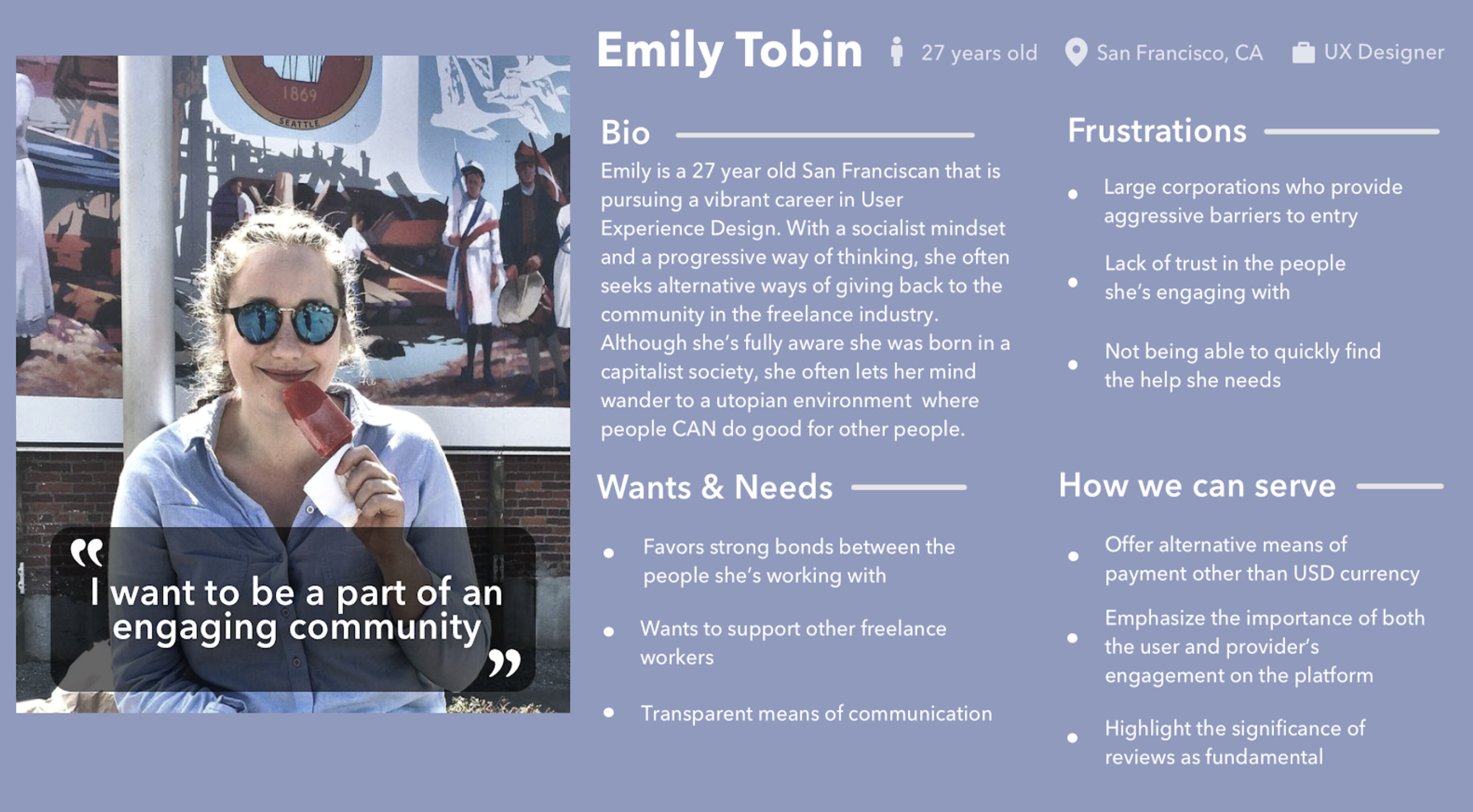
Created by Ami Sahota (UX Researcher)
Storyboard
I decided to create a storyboard based off of our persona, Emily, so that we could better empathise with her needs and keep her in mind as we redesigned the service booking flow. Additionally, I wanted to allow our client to see the importance of this redesign, as our client initially wanted our team to focus on another task outside of the UX scope. After presenting our persona, SUS scores, and storyboard, our client understood the importance of the service booking flow redesign and empathise more with her users.
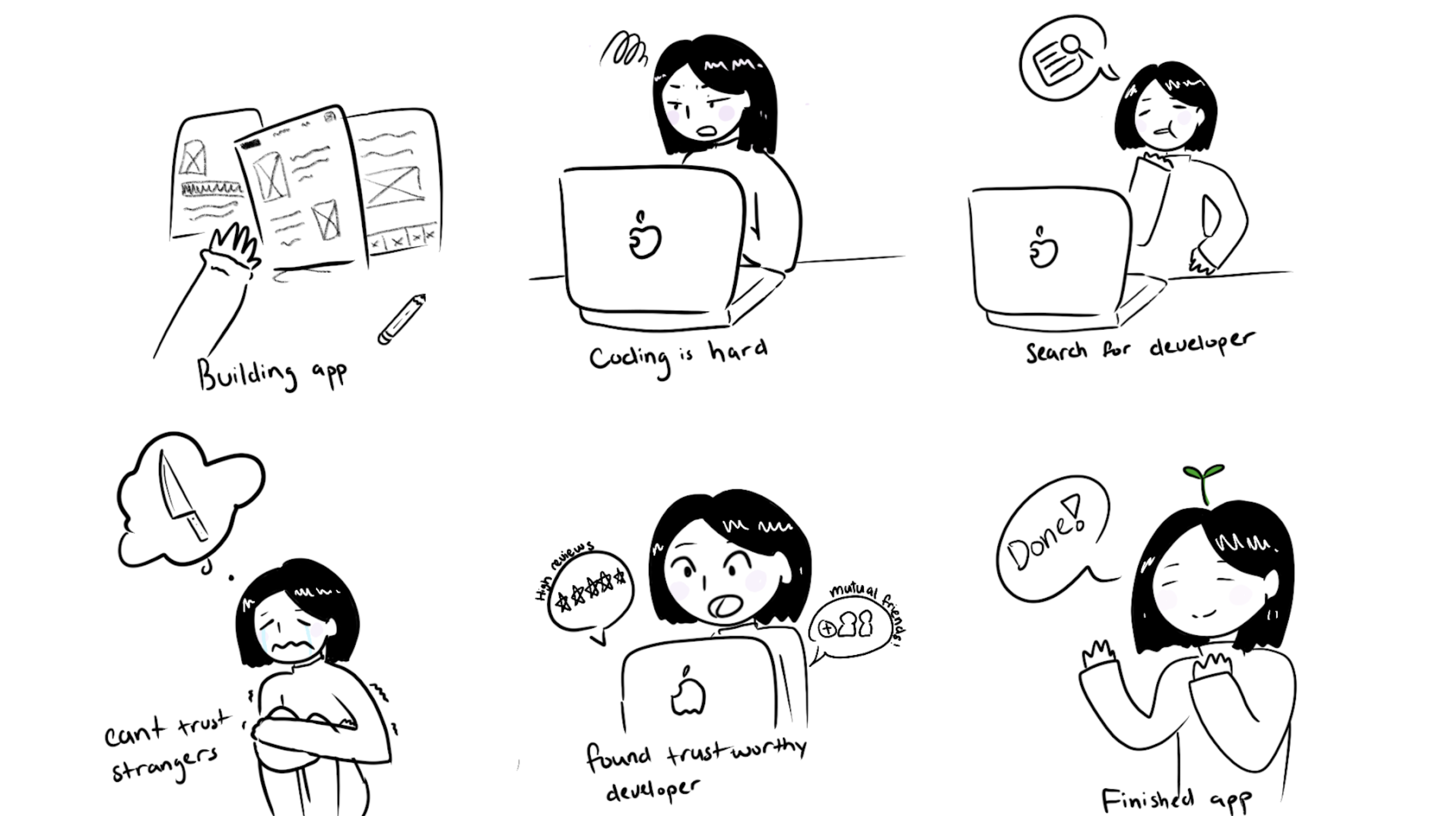
Emily is building an app. She designs an app for herself and attempts to code it in time for her upcoming interview. She realizes coding is difficult and decides to hire a developer. She looks around online to look for developers that can work in asap and in her tight budget. She finds a few developers but feels she can’t trust who she’s hiring. She comes across MyPeopleNow and finds a developer available with good reviews. She feels like she can trust this person and hires the web developer. Emily gets her app coded and her app is complete.
Competitive and Comparative Anaylsis
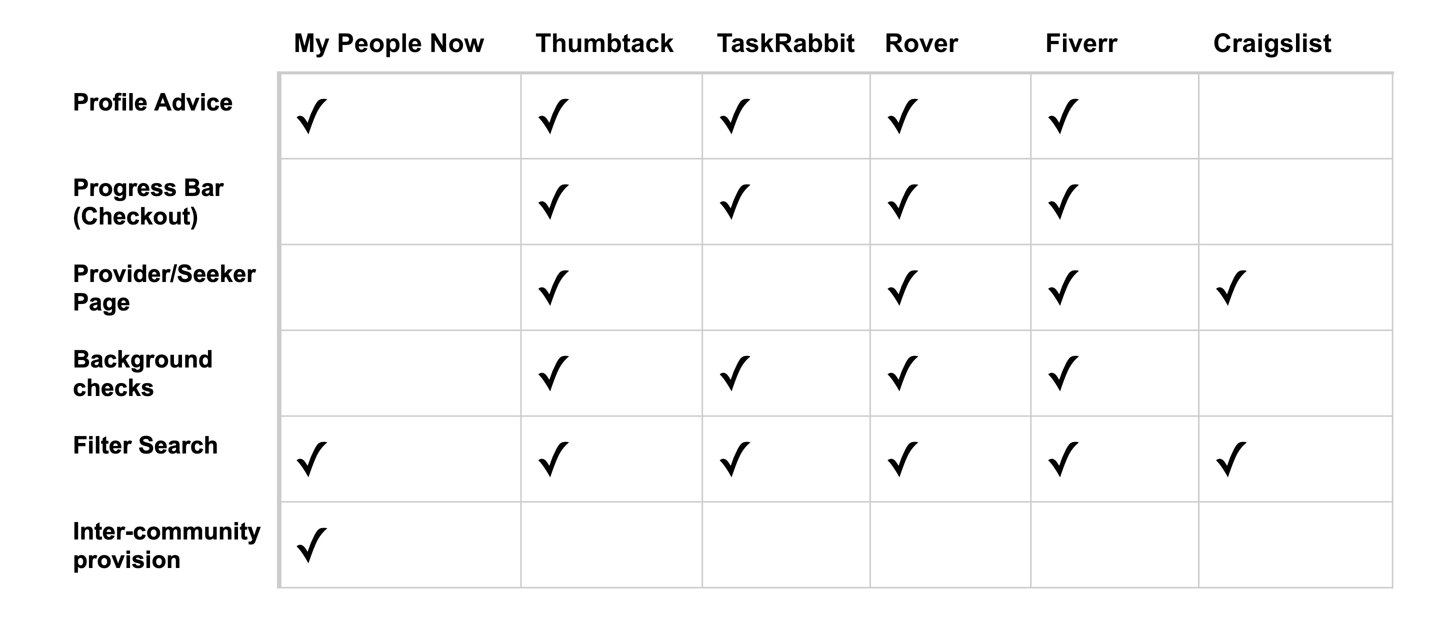
So based on the previous discussions/research, Christine and I looked at different companies that offer similar products/functions, such Thumbtack, TaskRabbit, etc. MyPeopleNow’s core strength is the inter-community provision. But what MyPeopleNow is currently lacking, which most comes to view during booking a service provider flow. So we aimed to strengthen the community perspective that MyPeopleNow has while implementing the other features in our user flow.
Usability Research of Current Site
For our redesign, we started off by looking into the current website of MyPeopleNow. We wanted to evaluate the current situation and get a good overview so that we could brainstorm general goals for the tests.
Ami did initial usability research for the website and found:
- Homepage does not inform what the site offers
- Difference between service and gigs
- Content overload
- Filter confusion
Current SUS Score: 37.5
So we knew moving forward that usability testing, proper Information Architecture, and contextual inquiry needed to be in place for the new redesign.
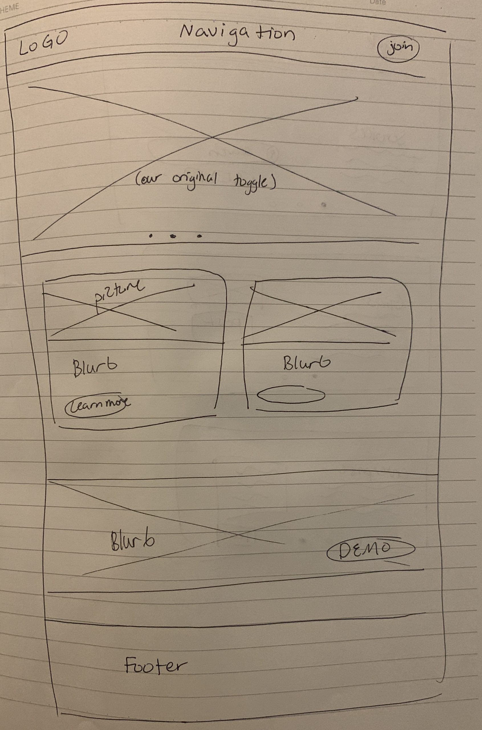
The current site on desktop
Presenting research
I wanted to show our client the importance of this redesign, as our client initially wanted our team to focus on another task outside of the UX scope. After presenting our persona, SUS scores, and storyboard, our client understood the importance of the service booking flow redesign and empathise more with her users. We also highlighted UX issues with her home page and how it caused confusions with the users. Our client agreed that she wanted to move towards a redesign.
She expressed that MyPeopleNow is currently developing an enterprise opt-in platform parallel to the customer facing gig economy, and that is why her current homepage is confusing and only temporary. She didn’t have any specific needs so our team had to fill in the gaps of what this homepage needed to have.
Additionally, our client asked if we could have a rebrand. She did not have a vision but knew she wanted a new logo and color palette. She mentioned that she wanted her brand to represent trust, community, and quality.
Design - Vision to Fruition
Design Overview:
My team and I worked closely with iterations and designs. Ami pulled through with great research analytics that guided the design, while keeping users’ needs involved with every step of the process. Christine carried out the service booking flow and analyzed heavily on how to portray trust with layout and context. I worked on the homepage design and information architecture.
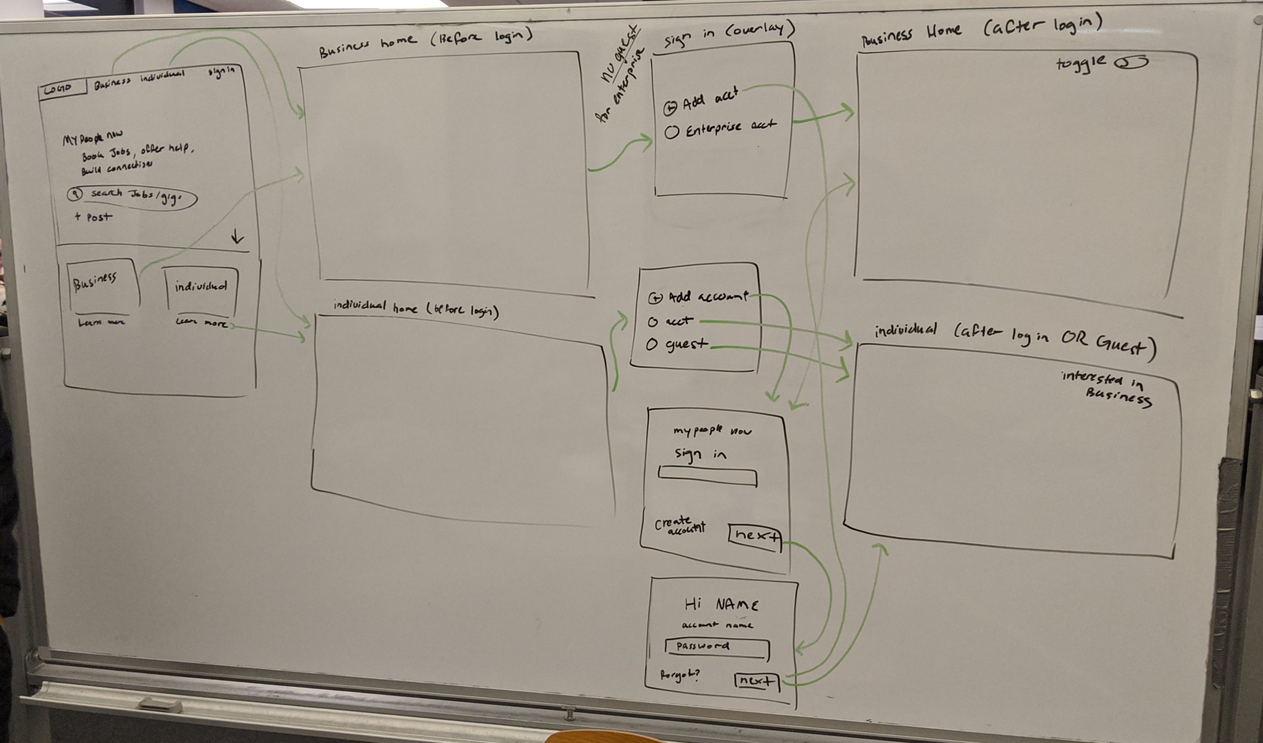
Sitemap
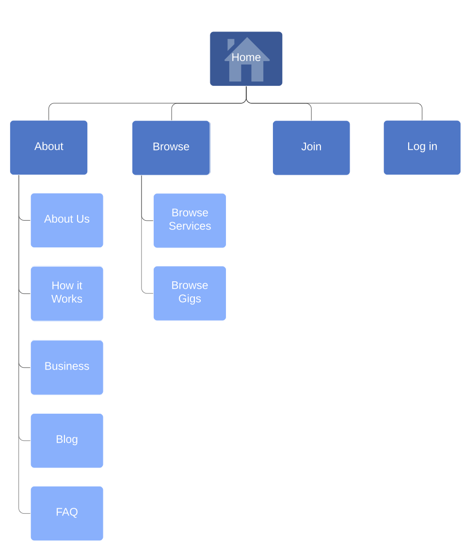
I decided to redesign the navigation bar, so I asked 6 users to do an open card sort.
The cards had a different page from the current navigation bar.
After we asked 6 users to do an open card sort, I asked users to arrange the nav items in the order that would make the most sense and to fit their priorities for this service.
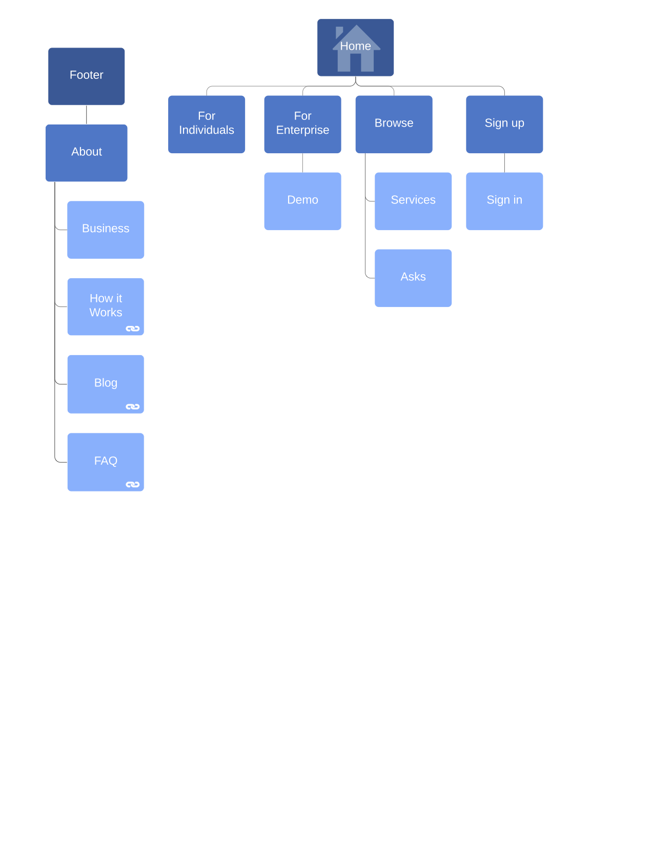
For the new sitemap, fleshing out both the personal and enterprise sides to the business allows users to gain a more high level use case for their preferred method. Blog, FAQ, and how it works were moved to the footer as many of our users perceived it lower on the hierarchy and wasn’t essential to fulfill their primary needs.
Original Website Sitemap
Sitemap After Card Sorting
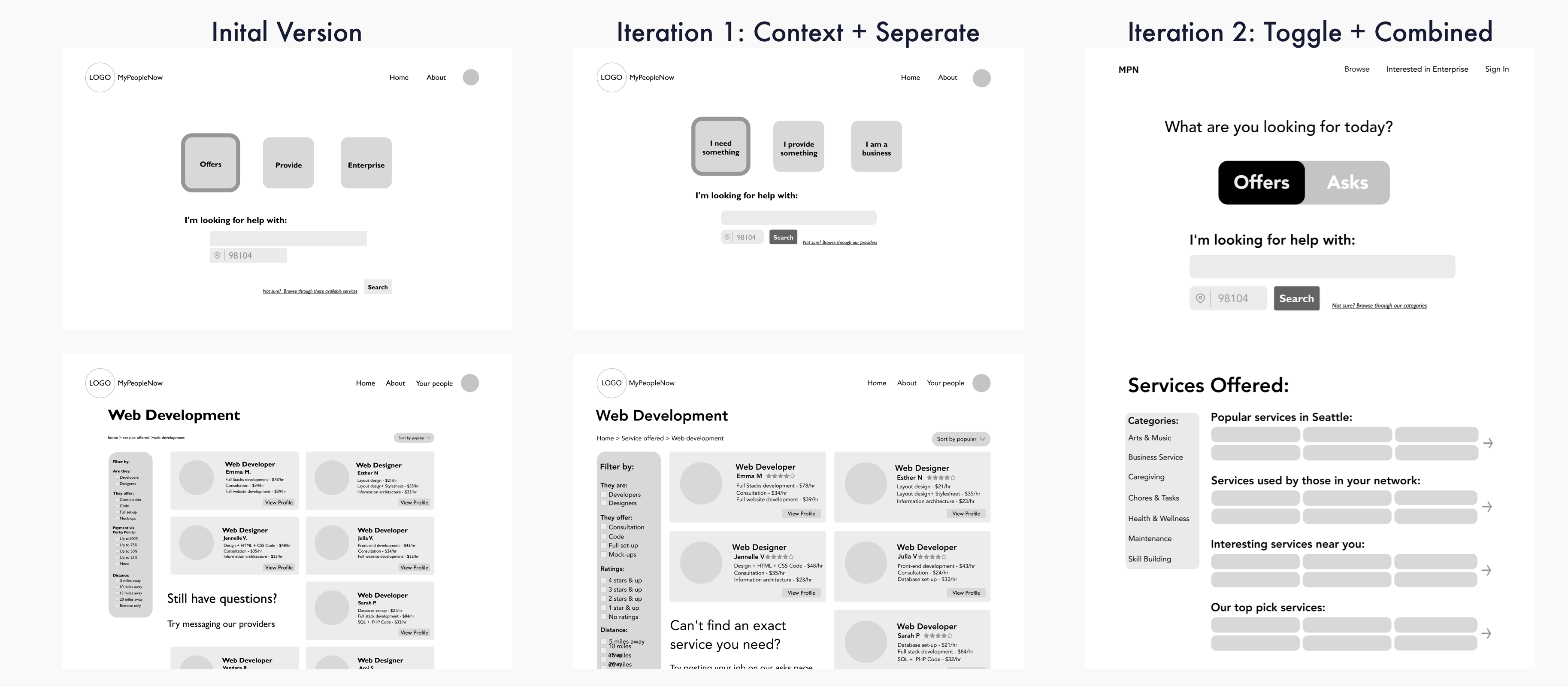
Home Page Redesign
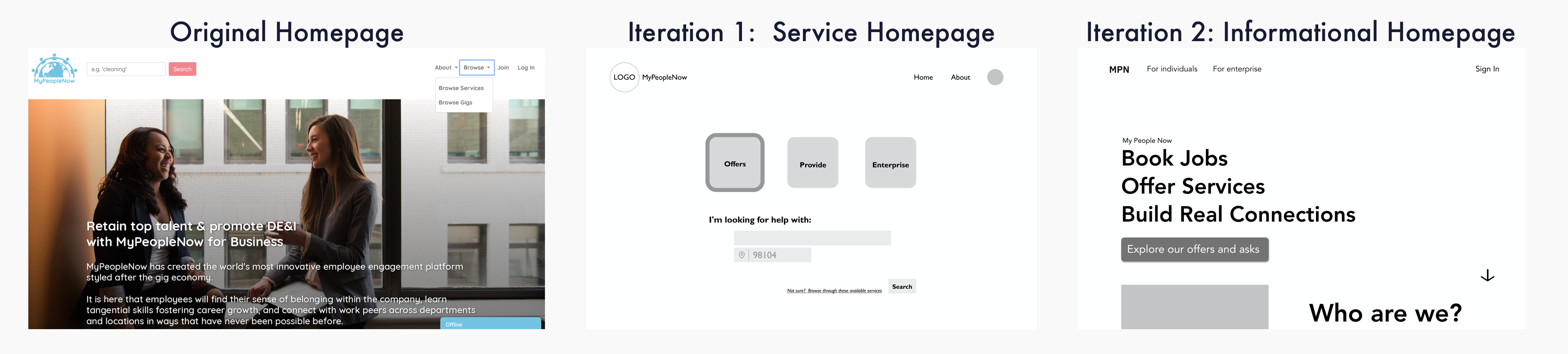
I redesigned the homepage to best fit the client’s needs. The client knew she had a gig economy currently available with offers and asks, but she wanted to have a homepage that would encapsulate the opt-in business engagement that is currently in development. Envisioning the homepage meant I needed to identify my MVP’s. Then I needed to do competitive/comparative analysis with businesses that have both enterprise and customer facing services. Our client also expressed that she wanted a log-in process that allowed businesses to be able to access both customer and enterprise sides with a toggle, BUT customer-facing only accounts cannot access the enterprise side. Additionally, the client wanted to have everyone involved in the community to be forced to make an account to interact with the services available on the platform.
From our usability data on the original site and our first version of the homepage, users were extremely confused on what the business had to offer. So I knew that concise context and informational hierarchy would be critical here.
I identified my MVPs to be :
- Traffic flow - To be able to push enterprises and individuals to their respective sides of the site.
- Service/Asks available - To allow BOTH enterprise accounts and individual accounts to view available services/asks. But also add a guest account flow so that new users can view the contents but cannot purchase without making an account. This is to remove any gatekeeping to new users.
- Join/Log in flow - To give both enterprise and individuals to see experience their respective content. We need to allow enterprise accounts to view both company specific content and individual facing content. And allow individuals to have the option to upgrade to enterprise content.
- Context - To give new users/early adopters proper information so that they can understand the services and benefits of opting into this community.
With competitive/comparative analysis, I looked at companies that offered multiple services with effective homepages, such as Uber, Lyft, AirBnb, and DropBox.
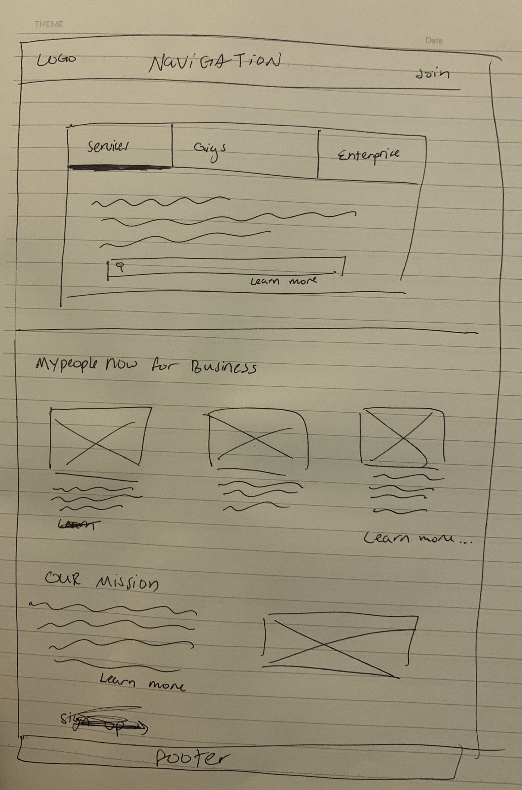
I involved my team through my whiteboarding to receive critique and eventually came to a design that made the most sense. Due to the restricted 2 week sprint, we did not get as much testing as I would like, but for next steps I would love to push my design through more testing.
Services Page Redesign
Designed by Christine Jahng
Profile Page Redesign
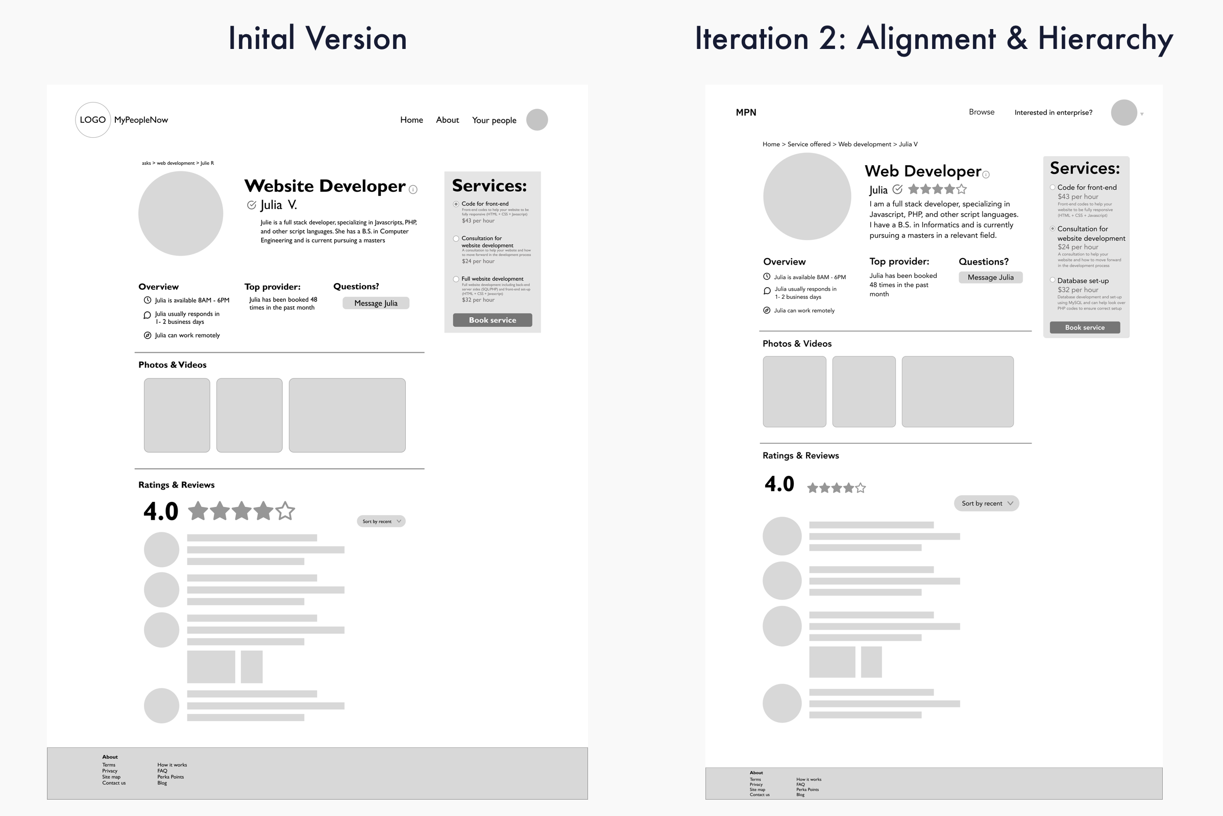
Designed by Christine Jahng
Rebrand with Style
Style Guide
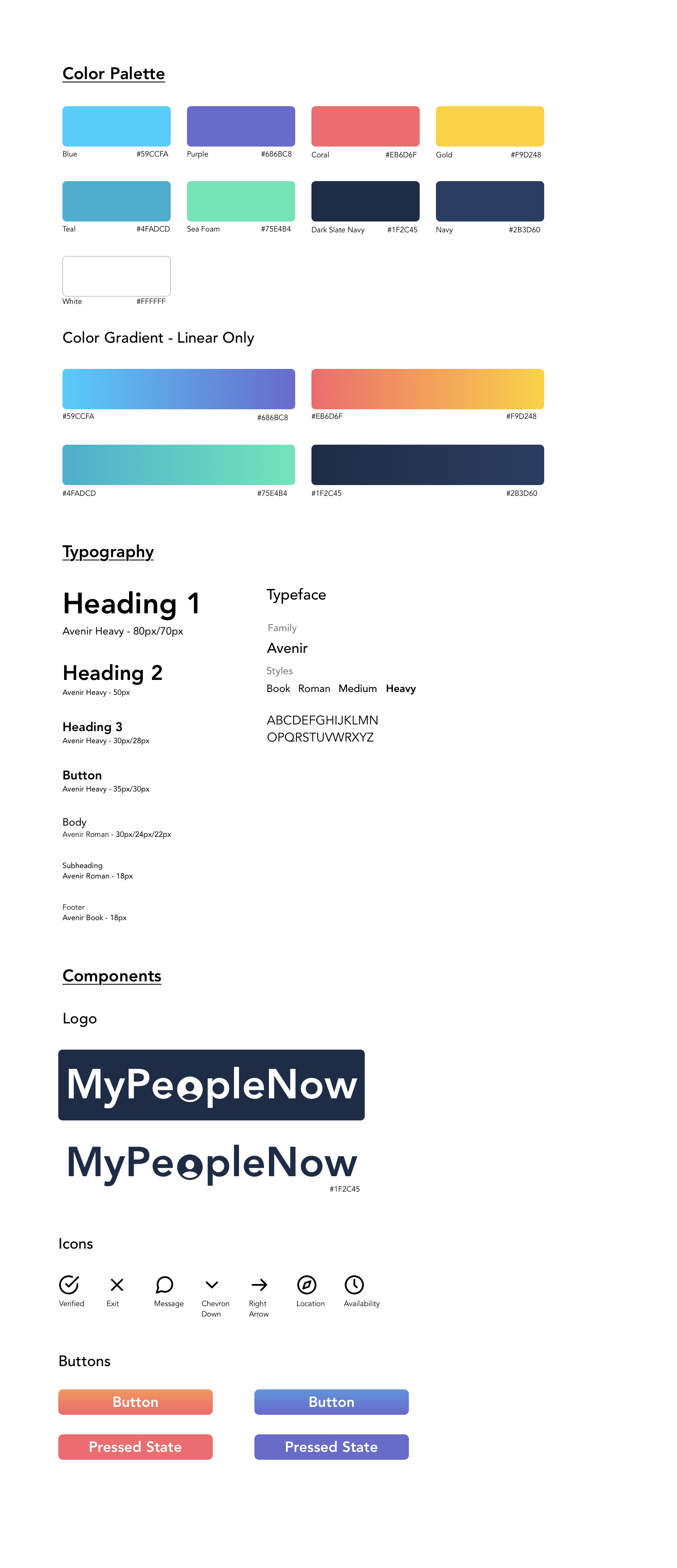
Color Palette
I really wanted to heavily portray that this is a comfortable, thriving, and trusting community. So I decided to look into the psychology of colors to see how we could better portray our client’s message.
- The blues are known to give feelings of familiarity and trust
- Purple is known to give feelings of wisdom and creativity.
- Gold elicits passion
- Coral encourages social behavior
Typography
To give the website a more professional feel, I moved away from the quicksand (original) font and towards avenir. The two main colors for fonts was chosen to be dark slate navy as well as white.
Logo
I decided it would be wise to give the logo a redesign as well. Compared to competitors, our logo felt outdated and complicated, as the current trend of logos were modern and simple.
With the logo redesign. I felt the avenir typeface would be best, to keep consistency. I wanted to emphasize the importance of the people who make up this community, so I added a person to the “O” in people.
Icons
With the icons, we went for a rounder softer look, to give a friendly feel, as most of these logos are found on the profile pages of service providers. We wanted users to feel comfortable when contacting these service providers.
HiFi Mockup of Home Page
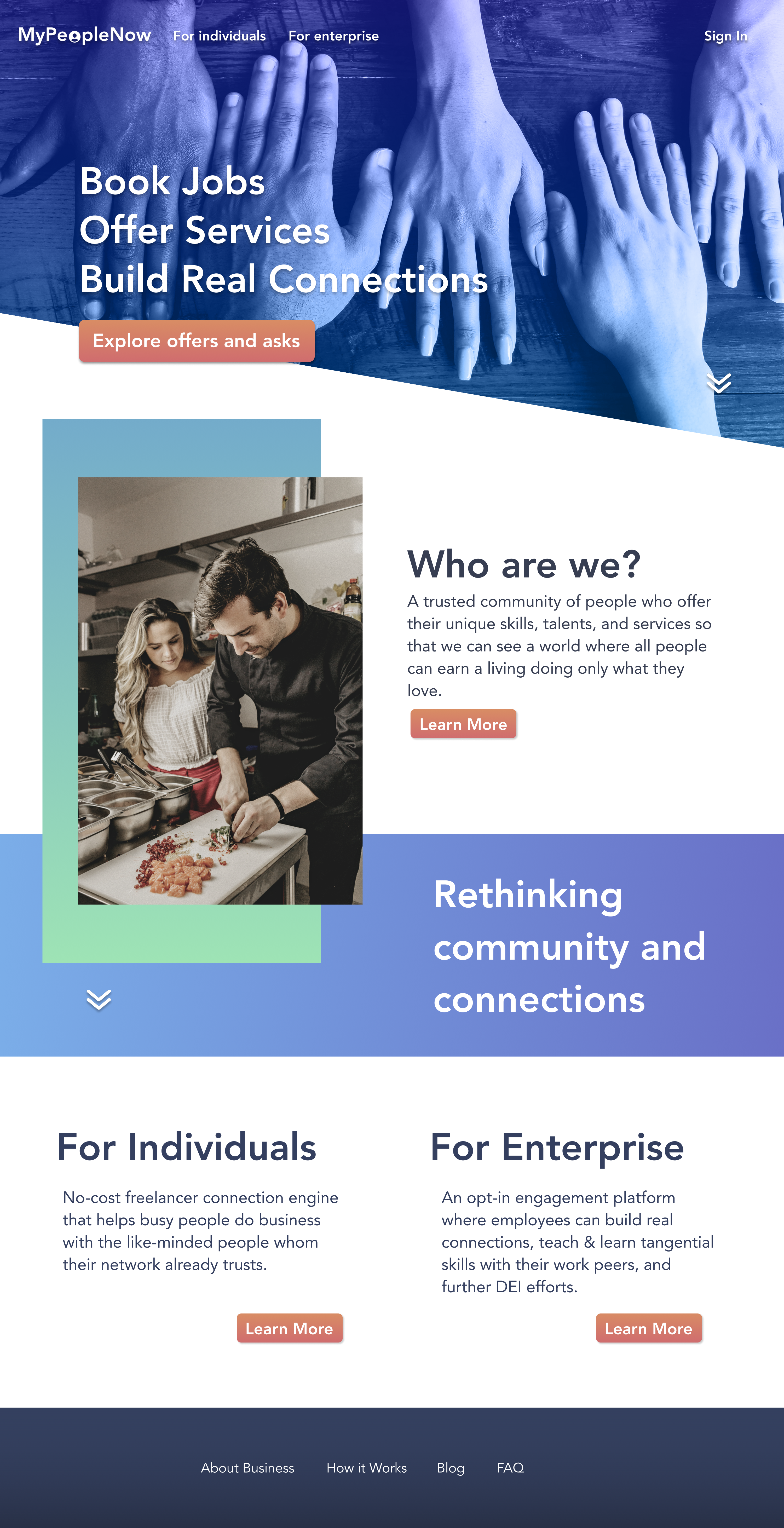
Click on image to zoom in!
HiFi Mockup of Profile Page
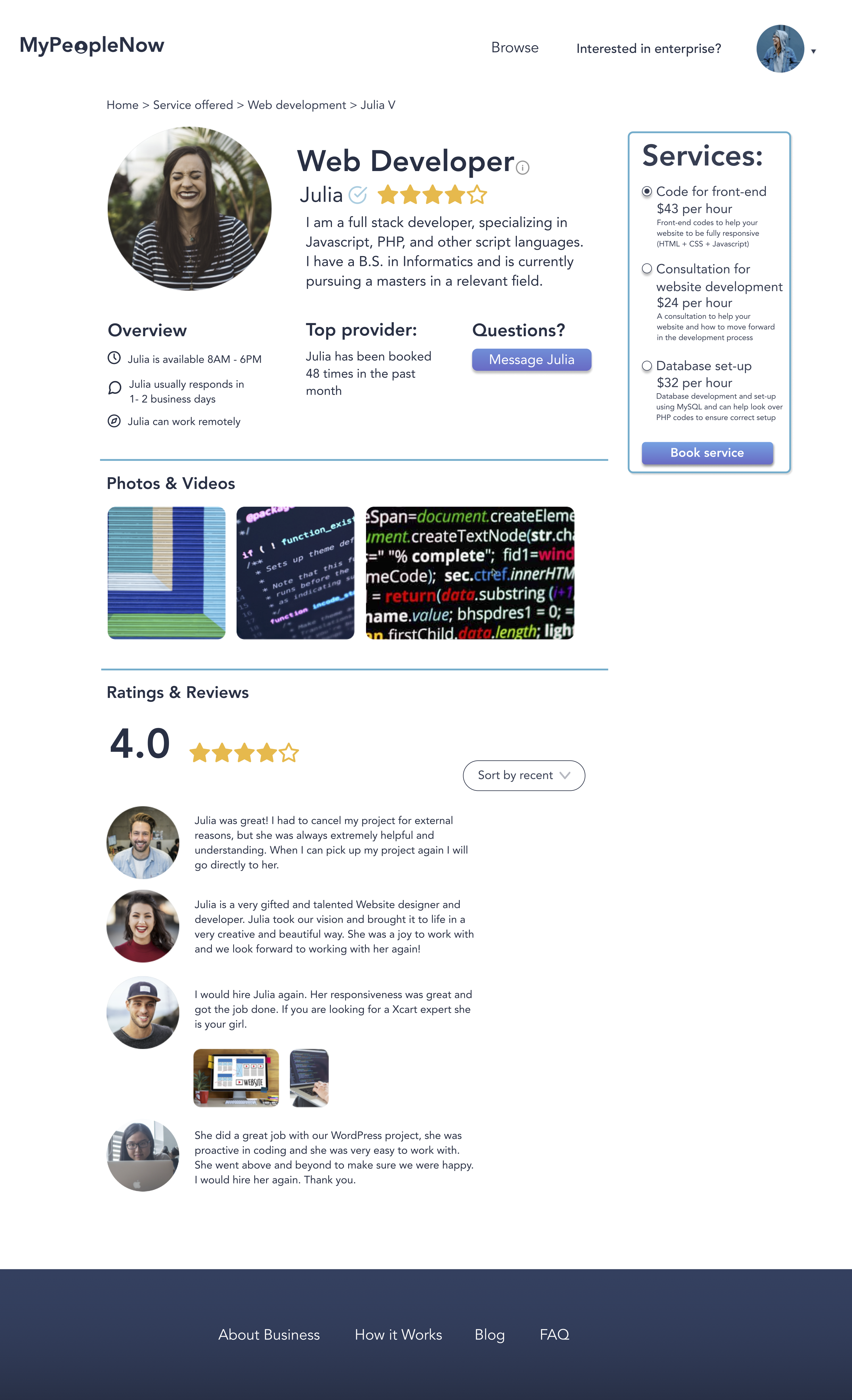
Click on image to zoom in!
2 Weeks Later - We Made It!
Results!
After our final iteration, we concluded at a SUS score of 85 which is a huge jump from our original SUS score of 37.5.
Prototype
Interact with the prototype!
Next Steps
If I were able to continue this project, my next steps would include:
- More testing
- We can always use more testing to help guide our design closer towards the users needs.
- Tackle the profile flow
- Include network vouch/validation
- As this is predicted to increase trust and bookings within the community.
- Include network vouch/validation
- Build out and refine the karma points system
- As currently it is not being utilized as much as our client would like, and many of our users mentioned they did not quite understand the karma points system.
- Flesh out the enterprise homepage
- So that companies can understand what benefits they can gain for opting into this service
- Create account flow
- So that users feel more incentive to flesh out their account and optimize their business on this platform
What I've Learned:
I learned how to balance between client and user needs. I learned that data is a powerful tool beyond guiding design for users, but also to showcase to clients that this may be the right direction and best rationale for their business. I also learned how to take a design concept and bring it to fruition, taking it beyond a redesign. Although incredibly difficult, I found it rewarding and fun. I had such a wonderful team and experience overall and hope to take this experience with me for my future endeavors.
 playlist